
Jonathan Jenkins Ichikawa is Associate Professor of Philosophy at the University of British Columbia. Most of his work to date has focused on epistemology, philosophy of language, and philosophy of mind. He received his PhD from Rutgers University in 2008.
Photographs and Objective Appearances
Jonathan Ichikawa
Thanks, Meena, for this platform. I’m trying to execute a post-tenure research pivot into some new areas; this is my first attempt to write down an idea I’ve been mulling over a couple years. It’s about one of my larger hobbies: photography.
Like memory, drawings, and prose descriptions written in notebooks, photography is a method to capture a record of how things look. Among such methods, photography is a bit unusual in enjoying a perception of objectivity. One can write down falsehoods in one’s notebook, or draw something incorrectly, but a photograph, by its nature, seems to record how things really are.
There’s something right about this, but I think it’s easy to exaggerate the degree to which photographs are neutral receptors of appearances. Photographers have a lot more control over how their photographs look than people generally realize. Consumers of photographs may give too much unreflective trust to photographs as records of appearances; and many photographers themselves are unaware of their roles in shaping appearances. Since photographers’ experiences are as ideologically-informed as anybody else’s, unreflective photographers risk making photos that are vehicles for bias.
I think a photographer’s capacity to influence appearances runs very deep. By the end of this blog post, I’ll be arguing that philosophers have a lot of control over how subjects are racially categorized. But, by way of warming up, let’s start with some more familiar examples.
Photographs of people represent how those people look. But they do so by measuring the light people reflect during a very short period of time. (Depending on the lighting conditions and other factors, my photographs of people usually come from shutter openings between 1/1000th and 1/30th of a second.) In the colloquial sense, people’s appearances do not dramatically change thousands of times per minute. Depending on exactly when a photograph is taken, one may end up with a dramatically different representation of how someone looks.
Here is a photograph of my dog Mezzo. It’s a fun photo, but a poor guide to how she looks. (It’d be a terrible choice for a ‘lost dog’ flyer.)
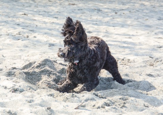 A thousandth of a second of Mezzo
When I photograph philosophers at workshops, I take lots of shots, knowing that many will capture odd or unattractive moments. I use my knowledge of how people behave to predict the likeliest moments for good shots. Afterward, I use my best discretion to select the best photos, deleting the others. (When in doubt, I ask the subjects for their opinions.)
The phenomenon of selecting flattering photos will be familiar to most readers. We all do it, relatively consciously. Only slightly less deliberate is the use of framing and cropping in setting up the shot. A photographer has tremendous flexibility in representing how a scene looks, by including or excluding various elements, or emphasizing certain parts of the scene.
In 2003, western media coverage of the toppling of the Baghdad statue of Saddam Hussain described a large crowd of enthusiastic Iraqis. Photos like these corroborated that description.

Photo by Alexandra Boulat

Photo by Robert Nickelsberg
But the media and the US military later came under criticism for giving a skewed perspective on this event. Wider-angled photographs made the crowd appear smaller than the tighter shots suggested.
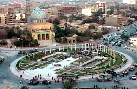
Photo credit unknown. Widely attributed to Reuters
I agree with the critics this far: the published photographs were designed and selected to emphasize the size of the crowd. Had the photographers’ agenda been to trivialize the crowd, they would have designed different photos. But the published photos aren’t fraudulent in the sense that they represent things as different than they were. They’re not false, the way they would be if someone photoshopped in a picture of Zapp Brannigan. They do reflect an ideology and an agenda; but in this respect, they are similar to all deliberately chosen representations.
(This is not to say it can’t be actively dishonest to shoot from a particular perspective. Just as one can be actively and culpably dishonest by being misleading without actually telling a lie, so too might one be actively and culpably dishonest by shooting from a specially tailored perspective, without actually forging a photograph. Just ask this real estate company.)
Let’s move on to less obvious ways a photographer’s decisions will affect how things look. Some have to do with adjustments our eyes and minds tend to make, without our noticing. For example, humans are good at seeing things in a wide variety of lighting conditions. There can easily be hundreds of times as much light outside as there is indoors. Here are two photos of a bear dressed as David Hume.


I think they’re each reasonably well exposed. The first was taken outside in the sun, with a shutter speed of 1/8000 of a second; the other was taken minutes later in my comfortably lit living room, with a shutter speed of 1/6 of a second. All other exposure settings were equal. Similar exposure required over a thousand times as much light sensitivity indoors.
Our eyes adjust, and we can see just as well in either place. Cameras adjust, too. In the fully or partially automatic modes most of us use most of the time, cameras quietly take their best guesses of how well lit you want the scene to appear. But if you shift a DSLR into fully manual mode, you’re forced to think through decisions usually made under the hood. How much should I expose the shot? How bright do I want the scene to appear? This isn’t straightforwardly a question about what the scene looks like. It is an artistic decision about how one wishes to make the scene appear. (It was much darker inside than outside, but my photos don’t represent that fact. Is this an inaccuracy?)
Here are two photographs I took this morning, seconds apart, in identical lighting conditions. I gave one more exposure, resulting in a brighter overall photo. Neither is more accurate; one chooses between them on aesthetic grounds. There’s just no fact of the matter about whether the scene really appeared lighter or darker.


But this means, once again, that a photographer has considerable influence over how someone appears, even setting aside all the decisions about framing, timing, and shot selection. Some of this power is wielded on the computer after the camera has been put away. (Equivalently, some of it used to happen in the darkroom.) A naïve view would have it that any such ‘digital manipulation’ constitutes a deviation from the objective visual truth the camera recorded. There is a way the image appears when I plug the SD card into the computer, before I start post-processing work. But that’s just my software’s best guess as to how I’d want the photo to look. Different algorithms will produce different guesses. The work I do on the computer typically improves on the guesses, making the photos look more like one might think they should. (My camera almost never makes a good guess with white balance indoors, for example.)
To manipulate appearances, then, is part of what it is to be a photographer. Photography is a kind of objectification of a subjective experience. Setting aside fraud, one’s photographic decisions aren’t a matter of getting things accurately or inaccurately.
This isn’t to say one’s decisions in this realm are beyond normative appraisal. Far from it—the way someone looks in a photograph can have a dramatic impact on how they are perceived. Nowhere is this clearer than in the case of lightness and darkness, which is coded perceptually very closely to race.
In 2008, Barack Obama was running to be the first black President of the United States. Some of the attack ads he faced, both from primary opponent Hillary Clinton and Republican nominee John McCain, were accused of presenting him with a darkened skin tone. A 2015 Stanford study confirmed that negative McCain ads, especially ones connecting Obama to crime, consistently portrayed Obama’s skin as darker. (It also confirmed that darker appearances can have dramatic psychological effects on voters without their realizing it.)
A still image from a McCain attack ad, showing Obama’s skin as rather dark.
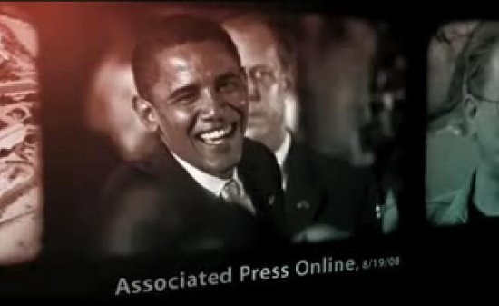
Visually emphasizing the darkness of your black opponent’s skin to make him less popular is a deplorable and disgusting display of racism. But the problem, I think, is one of emphasis, not of accuracy. (Imagine counterfactually that whenever he spoke of Obama, the GOP nominee had described him as “my black opponent”. Super racist, and super gross, but not inaccurate.) The problem with these images isn’t that Obama is shown as darker than he really appears; it’s that they’re designed to exploit tacit racism to cast Obama in a negative light.
Darker exposure in general is one way to make someone’s skin look darker. But when (as in this case) one is dealing with monochrome photos, there are more options. Black and white photographs depict colors as shades of grey. They use a color mix to convert colors to degrees of lightness or darkness. Are you going to make blue tones particularly dark, or particularly light? What about red? There’s no one best way to do this, which is why black and white conversion, too, is an art.
Here is a photo of a sunflower, along with two black and white versions.


Neither version here is more or less accurate. They differ in emphasis—for example, in whether the difference between the gold and red is highlighted—and in mood.
In Adobe Lightroom, the program in which I do most of my photo editing, black and white color mixes are managed via eight simple sliders, corresponding to how darkly to translate each color. Again, there’s no one best way to do this; it all depends on the particular photo and what you want it to look like. Here are the slider settings for the two sunflower conversions above:
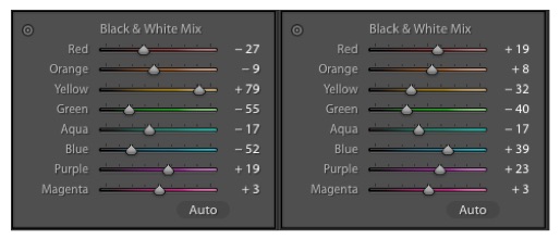
When making a black and white photograph, one can decide how dark to make selective elements in the photograph. The appearance of the outer petals of the flower, for instance, is largely a matter of the yellow slider.
When converting from color to a black and white photograph of a person, a photographer has a slider that controls how dark the subject’s skin appears. Human skin is almost always in the orange tones. So it’s only a slight oversimplification to call the orange slider a racial slider. Especially if one is a bit tan, or, like me, a bit racially ambiguous-looking, a photographer controls how white one looks.
Here are two different black and white self-portraits. These began as the same color photograph. There’s no difference in the lighting or framing, or the treatment of highlights or shadows. The only difference is in how dark orange becomes.


I do not think either of these images is more accurate than the other. One may be more similar to some people’s impressions of me, while the other may seem more accurate to others. (You might be more inclined to see me as lighter if you tend to agree with my political views.)
I was a bit flabbergasted the first time I realized I could change someone’s racial appearance with a Lightroom slider. The thing it really pressed upon me was the realization of the degree to which photography carries a serious moral responsibility. In photographing people and sharing their pictures, I am converting my own subjective experience—colored by God knows what—into an artifact that will shape others’ experiences of them. Taking a photo is a lot more like drawing a portrait or writing a description than we sometimes think. Accordingly, it should be treated carefully and responsibly.

Jonathan–if I may–thanks for this. Digital photography makes the intrusion of intention about final prints whether conscious or not a big thing, and maybe somewhat due to after-the-fact manipulation. But I have to think–as a fellow amateur who’s moved from film to DSLR over decades–the main difference in making *that* a factor is having many, many more shots to choose from. It’s always been a desideratum that good photography is a function of how many photos one can take–but digital photography has made that an easier barrier to overcome. I’d argue that the sheer number of photos that one can take digitally is the main factor that has influenced the matter of further Photoshopping of any photo taken–there’s just more to choose from that can be so manipulated.